

Ever been building a mobile optimised or responsive site – and been stuck on a rendering issue which only seems to happen on an actual mobile device? This can be rather annoying when you are trying to debug it on your desktop computer – sometimes you simply can’t replicate the problem.
With their web browser Safari, Apple have provided web developers with a quick and easy way to be able to debug and inspect elements on actual mobile devices (only iPhones and iPads currently). This has proved invaluable for us at Adao* when we are developing mobile optimised or responsive sites. Please note this will only work on an actual Apple Mac, and not on Safari on Windows.
First things first, plug in your iPhone!

You will have to have Safari open on your iPhone, with the website open that you want to inspect element on.
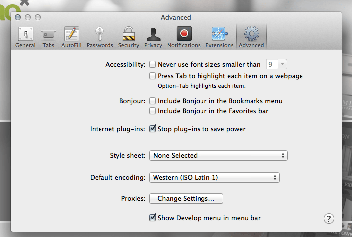
Next, open Safari on your Apple Mac. You will have to enable the Developer menu by going to Safari > Preferences > Advanced > Check the checkbox “Show Develop menu in menu bar”
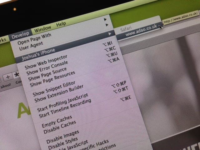
You will now have a “Develop” option in the top menu bar. Click it, and you will see your iPhone there as an option. Hover over it and it’ll show you the page you currently have open on Safari on your iPhone.
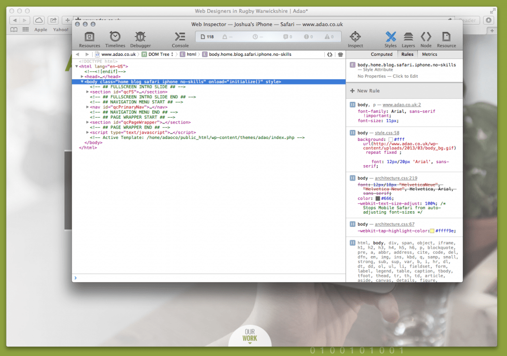
Click the page, and you will be presented with a Web Inspector window for the page on your iPhone. Cool eh?
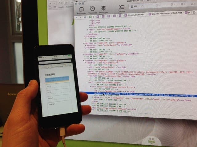
An even cooler feature is if you highlight an element in the web inspector it highlights it on your iPhone in real time. This means you know exactly what you are inspecting as you go through the elements.
You can then go through all the corresponding styles and edit them as you would the usual way to debug in inspect element, and that problem you found a pain to debug should be a doddle to fix!
Adao* are experienced web developers who specialise in mobile development. If you have any requirements at all, please feel free to contact us.